Brand Guidelines
The Applied AI Society visual identity. Warm, natural, and human.
Philosophy
Our brand is intentionally not techy. No circuits, no glowing grids, no dystopian sci-fi aesthetics. When people imagine the future of AI, they often picture something cold and mechanical. We want the opposite.
Think Windows XP's rolling hills. There's a reason that became iconic. Humans are naturally primed to feel good about green pastures and blue skies. It's calming. It feels like home.
The Applied AI Society represents a natural, positive progression for humanity. AI isn't something to fear. It's a tool that helps people do meaningful work. Our brand should feel like that: grounded, optimistic, and welcoming.
Why orange? It stands out. It's warm without being aggressive. And it's having a moment in fashion and design. It catches the eye without screaming.
Colors
#E67B35#FFC14D#FAF7F1#5B6E4D#1A1A1A| Color | Hex | Use |
|---|---|---|
| Orange | #E67B35 | Primary brand color, CTAs, links |
| Yellow | #FFC14D | Gradients, accents |
| Cream | #FAF7F1 | Backgrounds (warmer than white) |
| Olive | #5B6E4D | Nature elements, secondary accents |
| Text Dark | #1A1A1A | Headings, body text |
Background Style
Our backgrounds are warm cream with subtle paper texture. Not pure white, not flat. Think watercolor paper or soft linen grain with natural diffused lighting. This gives graphics an organic, inviting feel rather than a cold digital look.

Download: paper-background.png
Logo Gradient: #FFC14D → #E67B35 (used on “SOCIETY” wordmark)
Typography
| Element | Font | Notes |
|---|---|---|
| “APPLIED AI” wordmark | Helvetica Neue Bold | Or Arial Bold |
| “Live” script | Brush script | Custom, hand-drawn feel |
| Headings | Space Grotesk | Technical but friendly |
| Body text | DM Sans | Clean, readable |
/* Google Fonts import */
@import url('https://fonts.googleapis.com/css2?family=DM+Sans:wght@400;500;600&family=Space+Grotesk:wght@600;700&display=swap');
Logos
Main Wordmark


Download: Light SVG | Light PNG | Dark SVG | Dark PNG
Stacked Wordmark


Download: Light SVG | Light PNG | Dark SVG | Dark PNG
Applied AI Live (Events)


Download: Light SVG | Dark SVG
Graphic Elements
Rolling Hills
Stylized green hills representing growth and grounded optimism.

Download: rolling-hills.png
Wildflowers
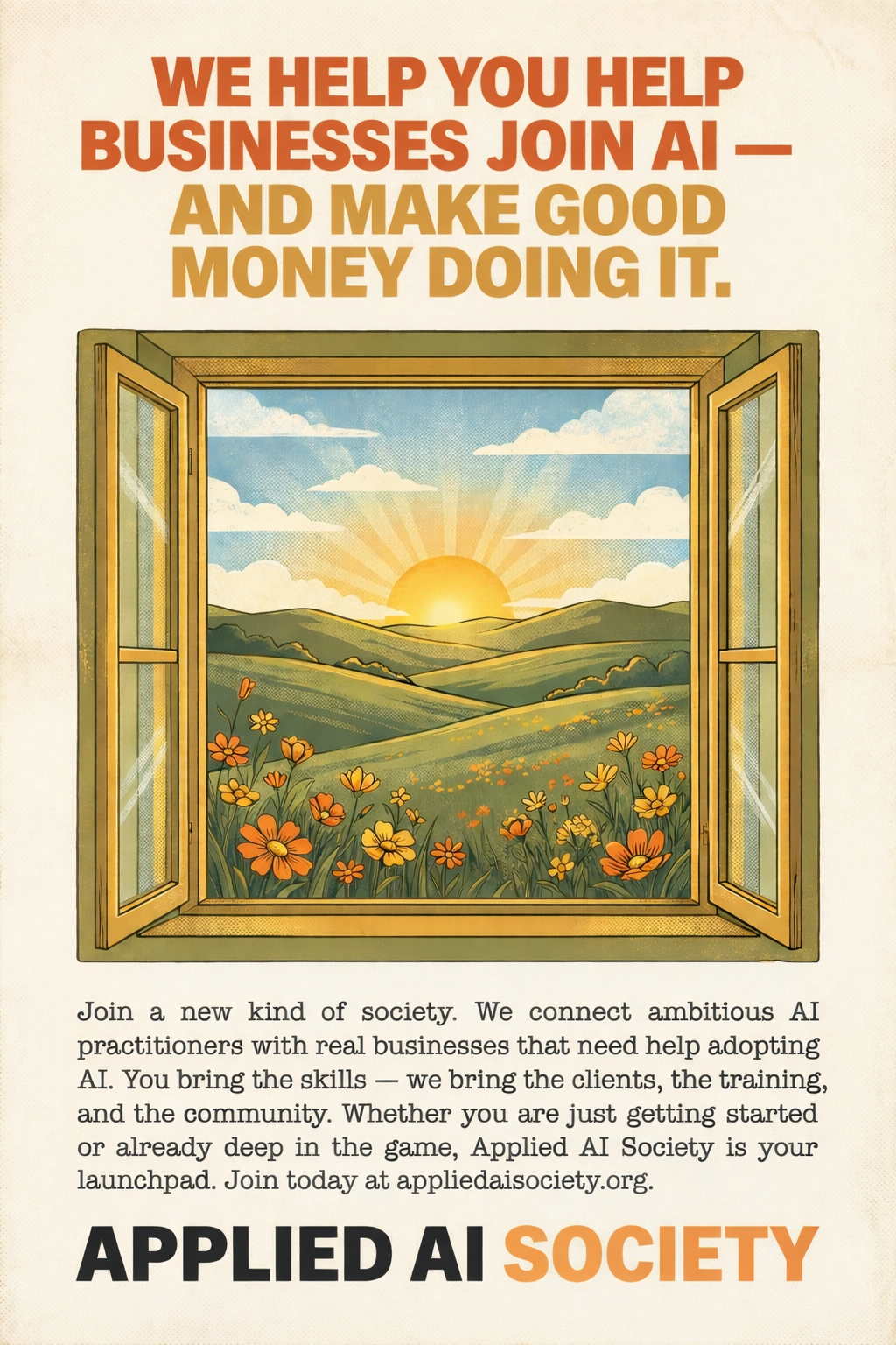
Yellow and orange wildflowers are a great accent in brand illustrations. They echo our primary orange and gold palette and add warmth, life, and natural beauty to landscape scenes. Use them in pastoral compositions alongside rolling hills and sunrises.

Example: Retro-style flyer with orange and yellow wildflowers in the landscape.
Download: wildflowers-flyer.png
Sun Icon
Warm sun representing energy and new beginnings.

Download: sun.png
Animated Sun (React + Framer Motion)
Drop this into your React app for a slowly rotating sun. Requires framer-motion.
import { motion } from "framer-motion";

{/* Animated Sun */}
<div className="absolute top-[-60px] right-[-40px] md:top-[-80px] md:right-[-60px] -z-10 pointer-events-none mix-blend-multiply">
  <motion.div
    animate={{ rotate: 360 }}
    transition={{ duration: 120, repeat: Infinity, ease: "linear" }}
  >
    <svg className="w-[160px] h-[160px] md:w-[180px] md:h-[180px] lg:w-[220px] lg:h-[220px]" viewBox="0 0 400 400" fill="none" xmlns="http://www.w3.org/2000/svg">
      <g className="text-amber-400/60">
        {[...Array(16)].map((_, i) => (
          <rect
            key={i}
            x="195"
            y="0"
            width="10"
            height="80"
            transform={`rotate(${i * 22.5} 200 200)`}
            fill="currentColor"
          />
        ))}
      </g>
      <circle cx="200" cy="200" r="100" fill="currentColor" className="text-amber-300/30" />
      <circle cx="200" cy="200" r="70" fill="currentColor" className="text-amber-400" />
    </svg>
  </motion.div>
</div>
Notes:
- Uses Tailwind CSS classes for sizing and positioning
mix-blend-multiplyblends nicely with cream backgrounds- 120-second rotation for subtle, non-distracting movement
- Adjust
top/rightvalues to position in your layout
Favicon
All Applied AI Society web properties use the sun icon as their favicon. The sun is one of our core brand motifs representing energy, optimism, and new beginnings. It works well at small sizes and is immediately recognizable.
The favicon uses the brand gradient (#FFC14D → #E67B35) in SVG format for crisp rendering at any size. SVG favicons are supported by all modern browsers.
Download: favicon.svg
Implementation:
- Docusaurus sites: Set
favicon: 'img/favicon.svg'indocusaurus.config.ts - Next.js sites: Place
icon.svg(orfavicon.svg) inapp/orpublic/and reference via metadata - Static HTML:
<link rel="icon" type="image/svg+xml" href="/favicon.svg" />
Usage Rules
Do
- ✅ Use official assets from this page
- ✅ Maintain clear space around logos
- ✅ Use appropriate color version for background
- ✅ Keep backgrounds warm (cream > pure white)
Don't
- ❌ Recreate logos from scratch
- ❌ Change logo colors
- ❌ Stretch or distort
- ❌ Add shadows, outlines, or effects
Generate Your Own Assets
Need custom graphics? See Generating Brand Assets with AI for prompts and style references to create on-brand images with Gemini, Midjourney, or other tools.